
二十周年校庆Logo设计理念
As the Canadian International School of Beijing (CISB) celebrates its 20th anniversary, we proudly present a commemorative logo that embodies the creativity of our community and the fusion of Chinese and Canadian cultures. Inspired by over 200 student submissions, this design reflects our shared journey and vibrant future.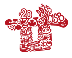
The logo’s framework is derived from the Chinese character “廿” (niàn), a classical representation of “twenty,” elegantly intertwined with the numerals “20” and “20 Years” to mark this significant milestone.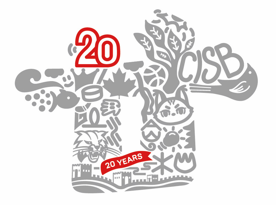
The school’s initials, CISB, and our beloved bobcat mascot (featured in two dynamic poses) further anchor the design in our identity.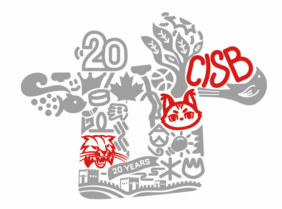
Symbolic elements carry deeper meaning:
• Maple leaf and Great Wall motifs celebrate the bond between Canada and China.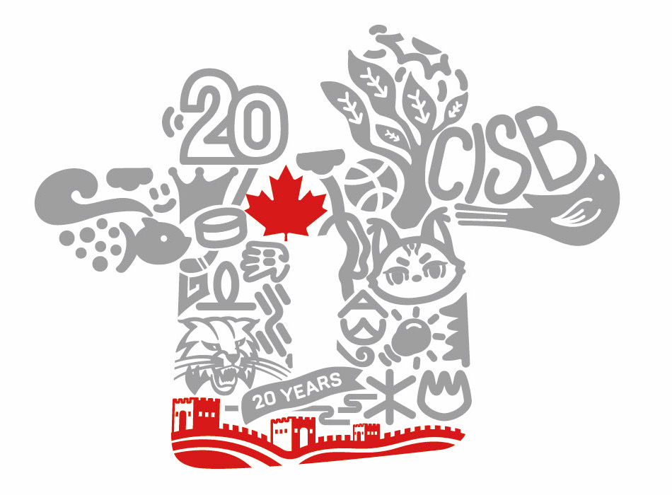
• Five hidden pictographs represent our school houses: Metal, Wood, Water, Fire, and Earth.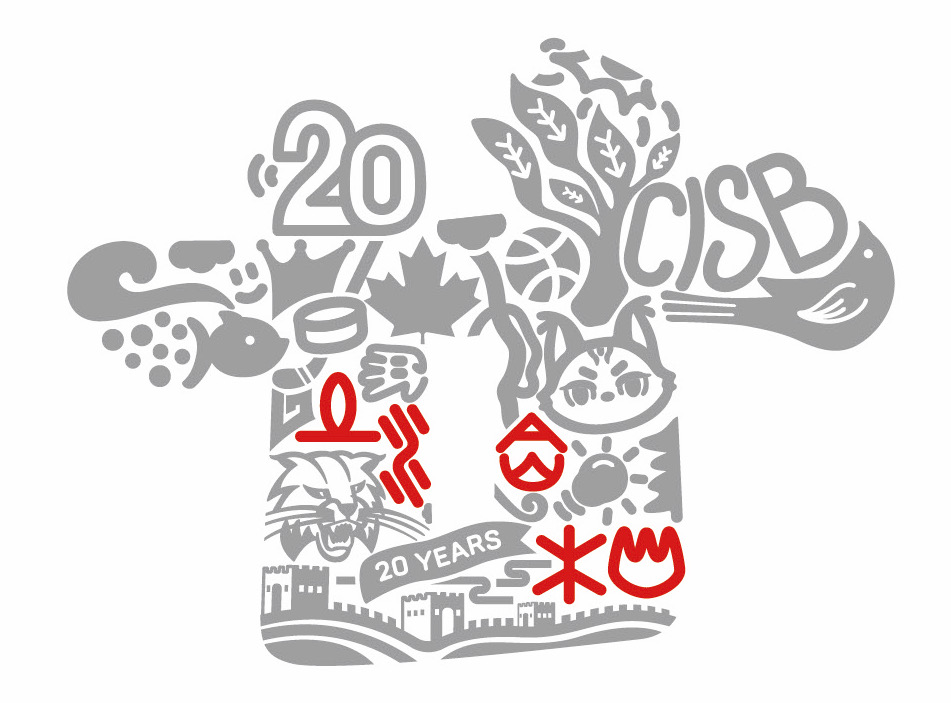
• Student-inspired icons—a crown, hockey stick, fish, tree, sun, lightbulb, basketball, and bird—reflect our diverse passions:
- Crown → Pursuit of excellence
- Hockey → Canadian heritage
- Fish → Wisdom and adaptability
- Tree → Growth and resilience
- Sun → Bright futures ahead
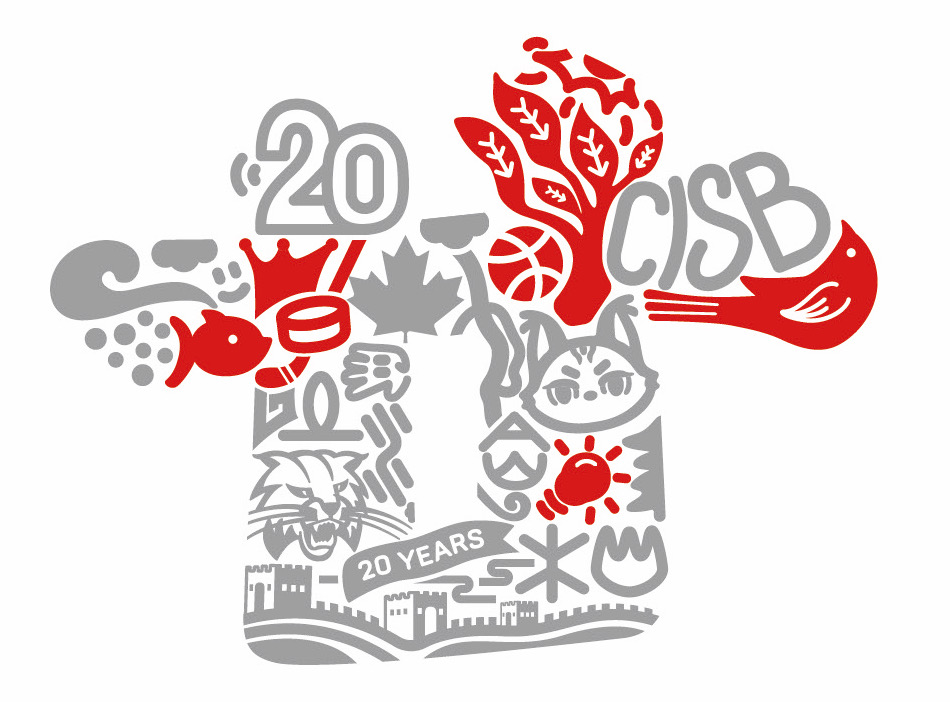
More than just an emblem, this logo is a visual narrative of 20 years of innovation, unity, and cross-cultural learning—and a promise of the greatness yet to come.
值此北京加拿大国际学校建校二十周年之际,我们以”廿”载芳华为灵感源泉,倾情打造凝聚师生智慧的纪念Logo。这份跨越文化的设计结晶,源自全校200余份学生投稿的创意火花,经专业提炼后,完美融合中加两国文化精髓。
主体造型取意汉字”廿”的古雅形态,既暗合东方智慧中对二十周年的典雅表述,又通过现代笔触勾勒出数字”20″与”20 years”的双重印记。
校名缩写”CISB”与两只灵动山猫吉祥物相映成趣,既延续学校视觉传统,又彰显青春活力。
设计细节蕴含深远寓意:
• 枫红长城纹样交织,谱写中加友谊的教育诗篇
• 五行象形符号暗藏玄机,象征五大学院生生不息
• 皇冠、冰球等十二种元素皆取自学生原创,见证着:
- 皇冠喻卓越追求
- 冰球显加国特色
- 游鱼寓智慧源泉
- 林木表成长轨迹
- 朝阳示光明未来
这份由师生共绘的视觉盛宴,不仅记录廿载耕耘的硕果,更承载着对下一个辉煌二十年的美好期许。每个笔触都在诉说跨越国界的教育故事,每处色彩都绽放着文化共融的绚丽光芒。